So IM was a great tool.
It no longer is.
Why? Primarily because we’ve all adapted to the concept of asynchronous communication, and we’re ready–we expect!– for a better, easier, more intuitive, more effective tool. What do I mean?
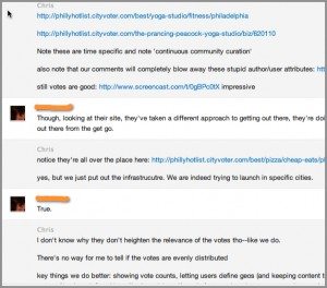
The problem: The Skype UX lays out communication in linear fashion–even though human conversation isn’t! Here’s a little illustration to remind you:

Tell me you haven’t had this IM experience: your typing fast on the initial thread and then someone veers off–so you follow. Then someone comes back to the initial thread before you’ve even finished typing a response to their tangent. Then you press ‘Enter’ on the tangent thread and the IM UX shows the response next to a non-corresponding line. Now your work has exponentially increased. Add another thread and you’re focused entirely on the screen above–double checking previous IMs to ensure your on target. At this point the UI is not making it easier–it’s making it harder. Fail.
The solution
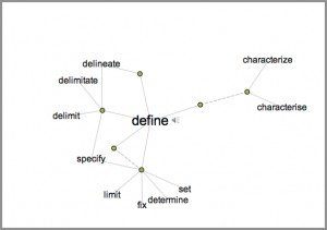
Now, imagine this: a branching IM a la Visual Thesaurus.

What if each comment or line had an imaginary box around it–and that box could be dragged around and anchored anywhere on a screen; and from each node could grow a conversation?
I would pay for that that!